
Colour Psychology for Interior Surfaces: How to Choose the Right Finish Colour for Each Room
There’s a specific kind of paralysis that sets in when you’re standing in front of a stack of acrylic sheet samples, trying to decide whether the kitchen should go pearl white or warm champagne. You’ve already spent forty-five minutes on Pinterest. Nothing is helping.
The problem isn’t taste. It’s that most colour advice is written for paint. And paint behaves very differently from decorative sheets for home interiors. A matte taupe on a painted wall absorbs light evenly. That same taupe on a high-gloss acrylic surface bounces it back at you. The finish is part of the colour.
This guide is written specifically for anyone choosing finish colours for decorative surfaces, acrylic sheets, polymer wall cladding, or wall panels and wants to make decisions that hold up in real light, across changing seasons.
Why Colour Behaves Differently on Decorative Surfaces
Most colour psychology content treats walls as flat, matte planes. But if you’re working with premium acrylic sheets or polymer laminate, you’re working with a reflective or textured surface, and that changes the colour equation significantly.
A deep navy in a matte finish and recessive; it makes a room feel smaller, more contained. That same navy in a gloss or metallic finish feels brighter and more visually prominent because it reflects ambient light. Neither is wrong. But they’re not interchangeable.
This is why finish type and colour have to be decided together, not separately. Choosing the colour first and the finish second is a common mistake. You end up with surfaces that are technically the right shade but feel wrong in the space.
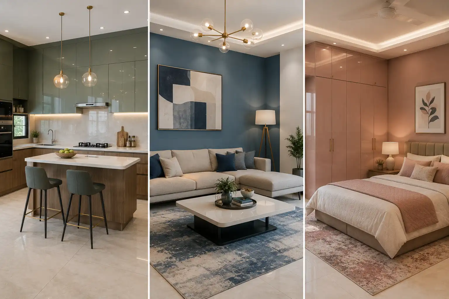
Living Room: Warm Neutrals and Statement Surfaces That Can Handle Attention
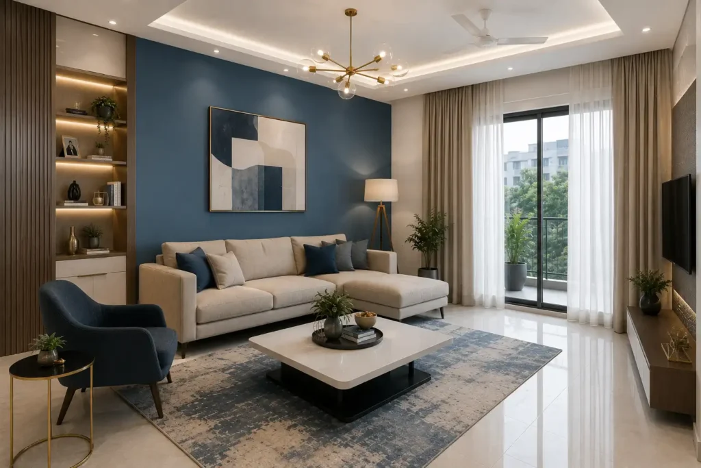
The living room is the one space that has to do everything: casual evenings, formal guests, natural light in the morning, artificial light at night. Colour here needs to be versatile without being boring.
Warm neutrals (greiges, warm whites, stone tones) are reliable because they read differently across lighting conditions without clashing with either. On an acrylic surface, a warm stone finish in a soft matte or subtle metallic works well in living rooms because it adds visual warmth without competing with furniture or textiles.
If you want a feature wall, this is the room for it. Darker tones-charcoal, forest green-deep burgundy work on a single accent wall in a gloss or sparkle finish without making the room feel oppressive. The key is area control: one wall, not four.
Essenczza’s Metallic and Marble finishes acrylic sheet format are worth considering for living room feature walls. The marble finish in warmer tones (beige-veined, warm grey) gives the depth of natural stone without the weight of installation and unlike natural marble, it doesn’t require sealing or the same level of ongoing maintenance.
For structured wall panelling, Iconica wall panels carry a confident presence that works in living rooms with higher ceilings. But if your living room runs on the smaller side, narrower vertical panelling keeps the proportions from feeling dense.
Kitchen: Brightness, Contrast, and Surfaces That Handle Real Life
Kitchens are the hardest room to colour correctly because the brief is contradictory: bright enough to work in, interesting enough to look good, and forgiving enough that it doesn’t look like a disaster after six months of cooking.
For kitchen cabinets and cladding panels, lighter colours often work better not because of any design dogma but because kitchens accumulate visual noise fast. Appliances, handles, tile grout, backsplash. A quieter surface colour gives all of that room to breathe.
Whites, off-whites, and light greys on a gloss or high-gloss acrylic sheet do two useful things in kitchens: gloss finishes are generally easier to wipe clean, and they help reflect available light around the space, making work surfaces appear brighter.
Matte finishes create a softer appearance, while high-gloss finishes reflect more light but may make fingerprints and smudges more noticeable.
Essenczza’s Solid and Mirror finishes in the lighter end of the palette pearl, warm white, light champagne are well-suited to kitchen cabinets. Dexiglas Crystal in a 2.0 mm high-gloss reflective finish is particularly useful for smaller kitchens where you want to borrow as much light as possible without adding a skylight.
One practical note: avoid very dark kitchen cabinets unless your kitchen has strong, positioned task lighting. Dark acrylic in poor kitchen lighting can make food preparation feel less comfortable if task lighting is insufficient.
Bedroom: Cooler Tones, Low Contrast, and Finishes That Don’t Demand Attention
The bedroom has one real job: let you sleep. Cooler, muted tones are commonly associated with calm, making them a popular choice for bedrooms. The mistake people make is choosing bedroom colours they love looking at rather than colours they can stop looking at.
Soft blues, greyed lavenders, sage greens, and dusty roses all work because they don’t demand attention. They recede. On decorative sheets for home bedrooms whether on a headboard wall or cabinet fronts a matte or subtle textured finishes are often preferred over high-gloss. Gloss finishes reflect ambient light and create visual activity. That’s fine in a living room. In a bedroom it’s counterproductive.
Essenczza’s Matte finish range in cooler, muted tones is the obvious pick for bedroom surfaces. The wood-grain options in lighter oak or natural tones also land well in bedrooms; they’re warm without being stimulating, which is a harder combination to pull off than it sounds.
Avoid metallic or mirror finishes in the bedroom unless they’re on a small accent area, a cabinet front, or a narrow niche panel. Mirror finishes catch ceiling light and movement, which is something many people prefer to minimise in a bedroom.
Bathroom: Fresh, Reflective, and Light-Amplifying
Bathrooms are almost always small, often windowless, and lit by artificial light that is frequently not flattering. The colour goal here isn’t drama, it’s making the space feel bigger and cleaner than it actually is.
White and near-white are popular in bathrooms for good reason. On a gloss or high-gloss acrylic surface, crisp white reads very differently from white paint; sharper, more luminous, and tends to reinforce a clean, bright appearance. Soft aquas and pale greens also work because they reference water without feeling cold.
Where bathrooms get interesting is in the finish. A bathroom wall done in a sparkle finishes a subtle shimmer, not disco catches bathroom lighting and amplifies it. It makes a windowless bathroom feel less enclosed. Essenczza’s Sparkle finish is worth looking at for exactly this reason, particularly in pearl or silver-adjacent tones.
Innova APT in matte solid or matte metallic works for bathroom wall cladding where you want something calmer and more architectural. The 1 mm polymer laminate format is designed for moisture-prone interior environments, and the matte finish tends to make water spots less noticeable than high-gloss finishes.
Home Office: Colours That Help You Think Without Distracting You
The home office colour conversation has gone too far in both directions: one school insists on white walls for focus, another insists on green for creativity. The honest answer is that it depends on what kind of work you’re doing and how your brain responds to colour stimulation.
As a general rule, medium-saturation colours work better for sustained focus than either very light (too bland, may feel too plain for some people) or very dark (too enclosing, may make smaller workspaces feel more enclosed). Warm greys, dusty terracottas, and muted teals are a good middle ground.
On a decorative surface in a home office panel cladding behind a desk, cabinet fronts, a niche wall a subtle texture finish like Engrave’s fluted 3.0 mm acrylic adds visual interest without colour complexity. It gives the eye something to rest on without competing with what’s on screen.
For colour, this is one space where Innova APT’s texture in a neutral tone works particularly well; the surface pattern provides enough visual interest that the colour doesn’t need to do heavy lifting.
Choosing Your Finish Colour: A Practical Framework
Before committing to a colour, answer four questions:
What’s the primary light source? Natural north-facing light is cool and blue-toned. The south-facing light is warm. Artificial light is either warm (incandescent/yellow) or cool (LED/white). Your surface finish will pick up the undertone of your dominant light source. A warm cream acrylic in cool LED light will read differently than in afternoon sunlight.
What’s the room’s function? Rest (bedroom), focus (office), and social (living room) have legitimately different colour requirements. Working against the function costs you comfort over time.
What’s the finish doing to the colour? Gloss amplifies. Matte absorbs. Metallic shifts the colour based on the light angle. Always view your sample in the actual room, in actual light, not in a showroom.
Are you choosing for now or for five years? Trendy colours cycle. If you’re installing premium acrylic sheets for home surfaces that will last a decade, a colour that’s peaking right now will look dated in three years. Neutrals with interesting finishes age much better than on-trend hues.
Need Help Picking The Right Finish?
Each space has a function, and the right finish can completely change the look, feel and performance of that space over time. When designing a kitchen, wardrobe or feature wall, the best choice is to match the finish to the space, not just follow trends.
Contact Dexarte for expert advice, design inspiration and finish recommendations to help you create the right mood, function and visual harmony on every surface.
Follow Dexarte on Instagram, Facebook, and LinkedIn for inspiration and surface innovations.